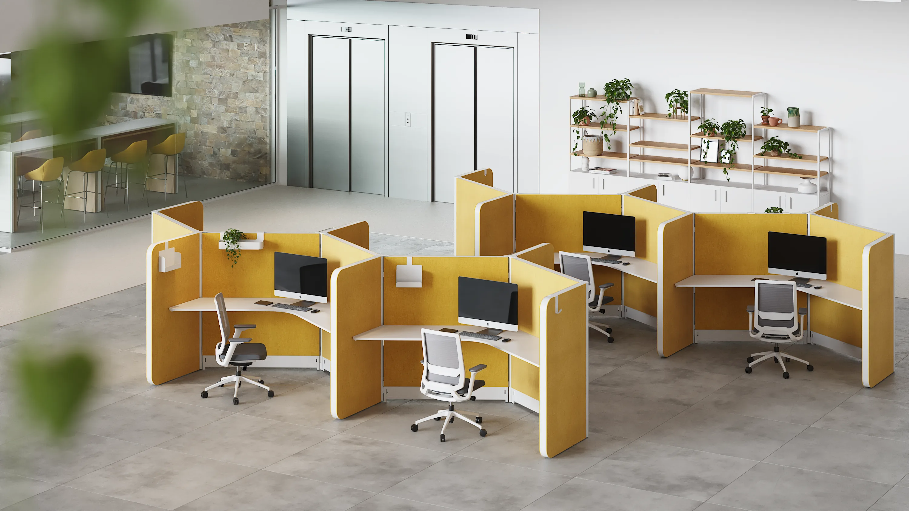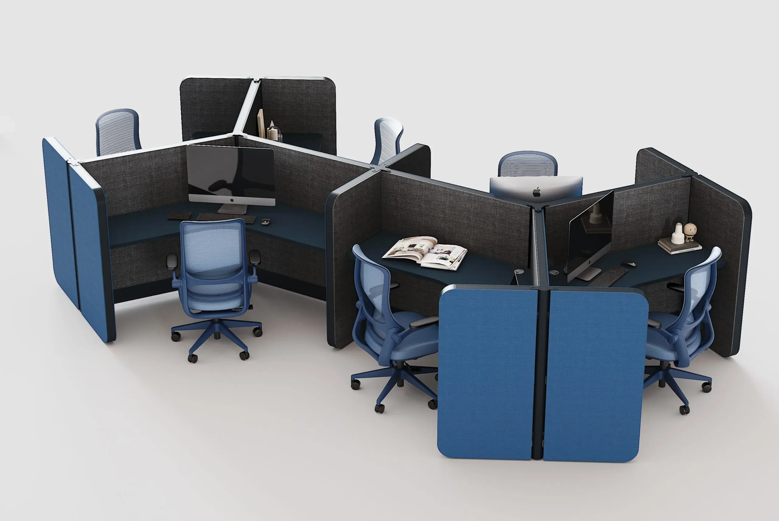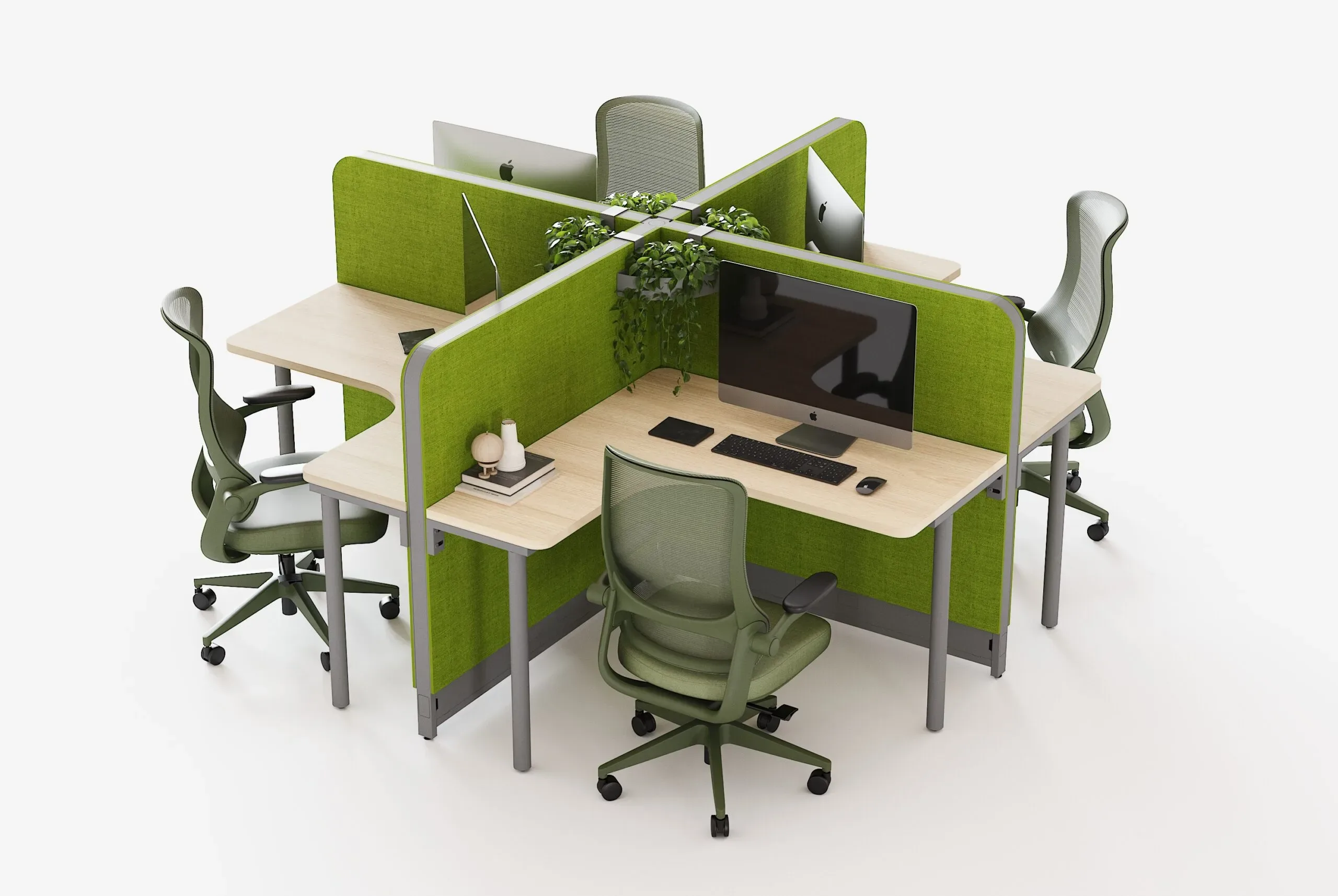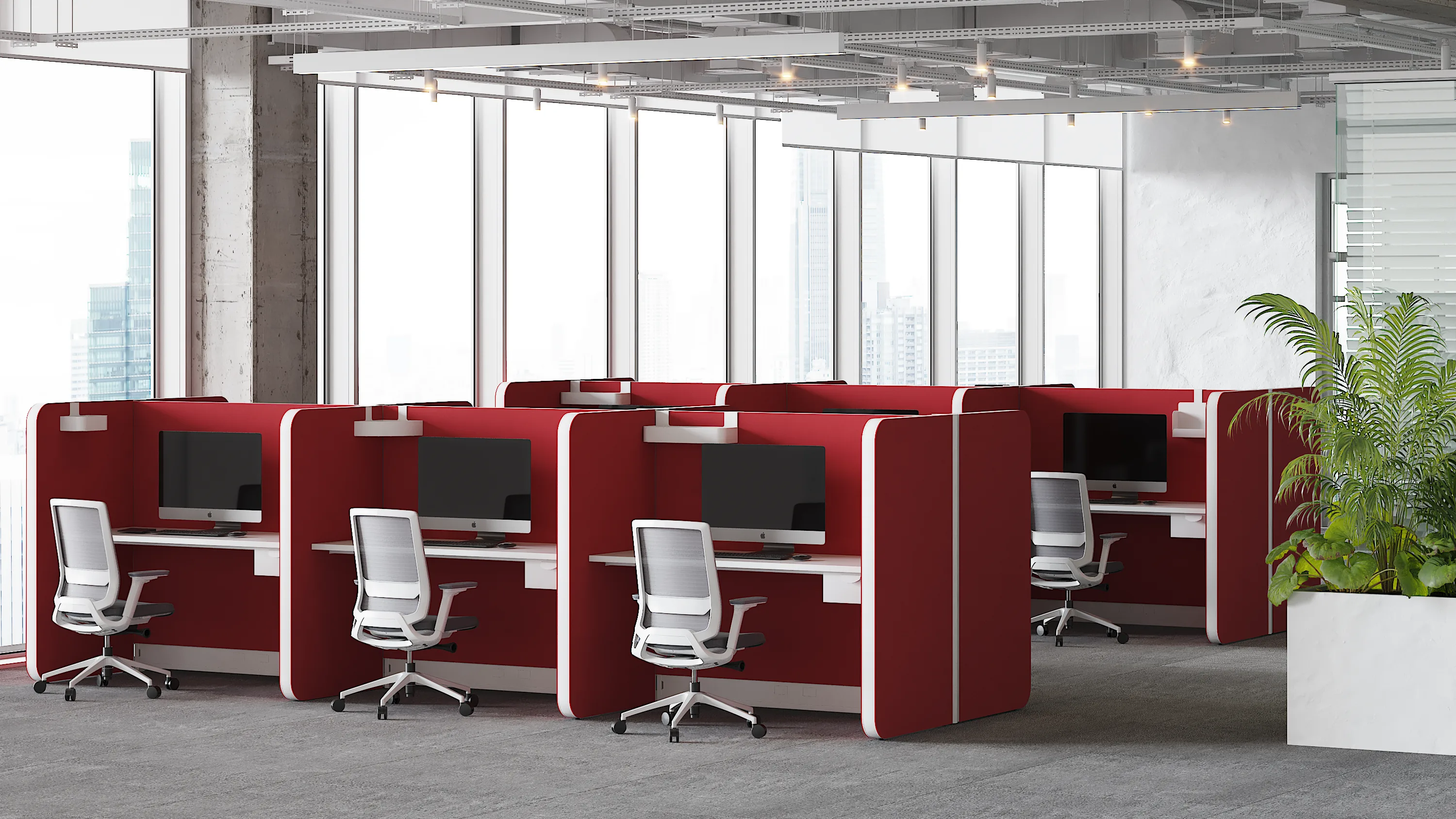
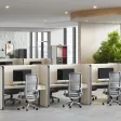





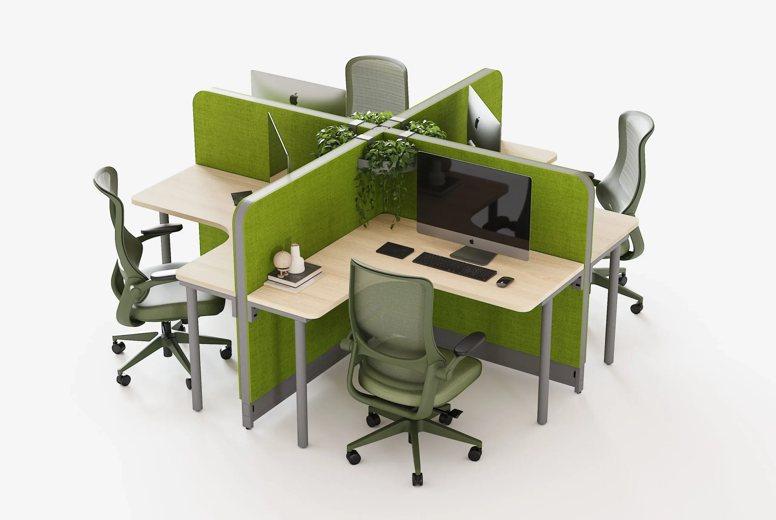
A creative office can't feel like any other office. Advertising agencies, design studios, digital product teams, and production companies work with ideas, and the environment where those ideas are generated influences their energy, their mood, and the way people collaborate. In that context, color stops being decoration and becomes a design tool.
Colored partitions for creative offices let you put that tool to practical use: they divide zones, control noise, provide visual privacy, and at the same time give the space personality without painting walls or doing construction work. In this article, we cover how to choose palettes, which materials work best, how to combine color with acoustics and functionality, and which mistakes to avoid so the result is vibrant without being chaotic.
Why Use Color in the Partitions of a Creative Office?
1. It reinforces brand identity
Color is one of the most recognizable elements of a brand. Integrating corporate tones into the partitions makes the space communicate who the company is, both to its own team and to the clients and candidates who visit.
2. It zones intuitively
Assigning a color to each type of area (focus, collaboration, meetings, breaks) helps people find their way around without excessive signage. The team understands the space at a glance.
3. It boosts creativity and mood
Monotonous environments tend to drain energy. Well-balanced color accents add dynamism and make long days in the space more pleasant.
4. It adds warmth to open spaces
Open floor plans with hard surfaces can feel cold. Partitions upholstered in warm tones soften the atmosphere.
5. It lets you make changes without construction
If your identity evolves or you want to refresh the space, changing or relocating partitions is far easier than repainting or remodeling.
How to Choose the Color Palette
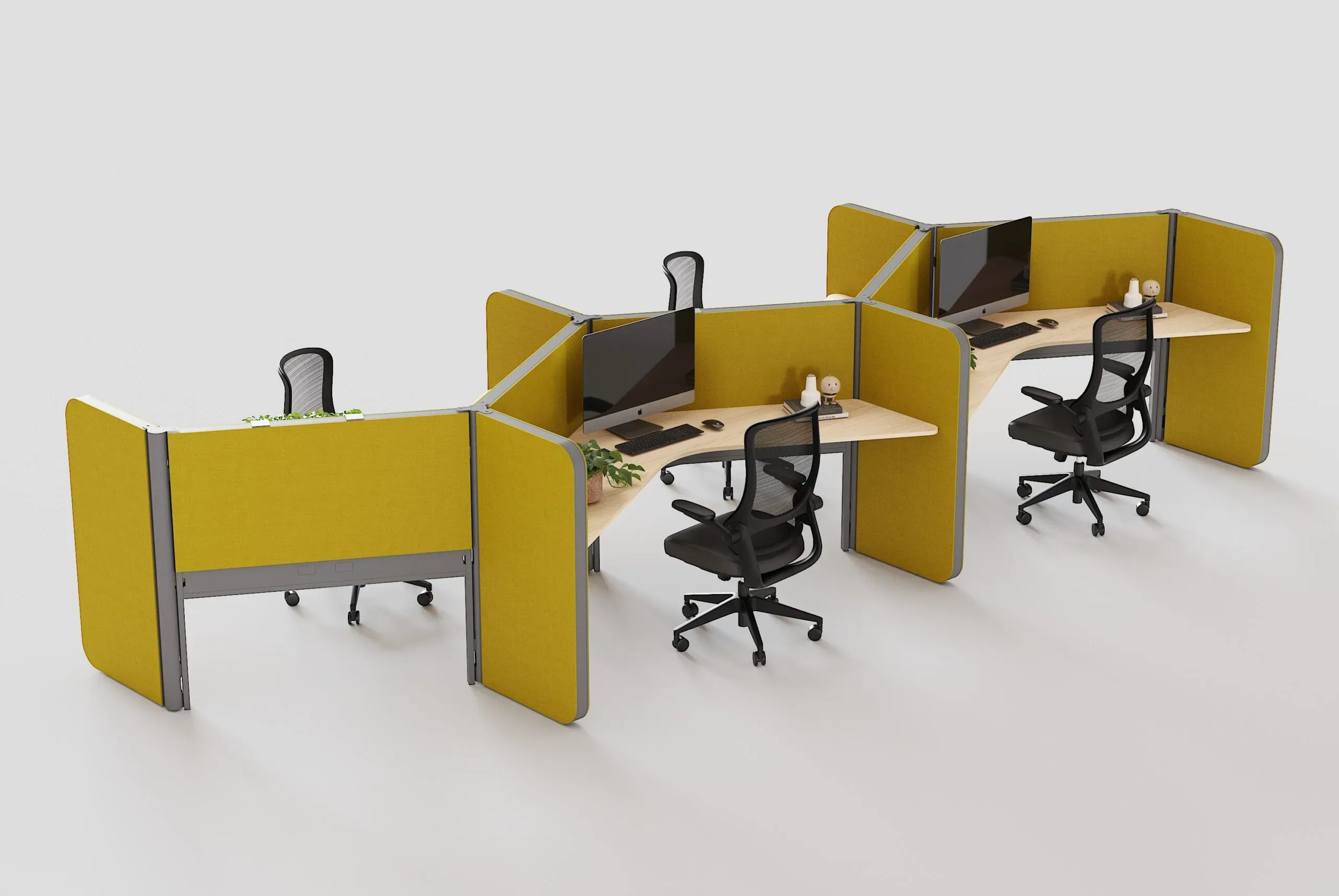
Start with the brand
Corporate colors are the natural starting point. It's best to use them as an accent or as the stars in specific zones, not necessarily throughout the entire space.
Define a neutral base
A balanced palette combines neutrals (whites, grays, light woods) with one or two accent colors. This lets color stand out without overwhelming the space.
Consider color psychology
As a general reference, not a rigid rule:
- Blues and greens: convey calm and support focus. They work well in individual work zones.
- Yellows and oranges: bring energy and optimism. Useful in collaborative and brainstorming areas.
- Reds and magentas: stimulate and grab attention; use them sparingly and in details.
- Purples and deep tones: suggest sophistication and creativity; they work well in meeting rooms and reception areas.
- Grays, beiges, and earth tones: balance and neutralize, ideal as a base.
Evaluate the light in the space
Natural and artificial light change how colors are perceived. A shade that looks great in a swatch can shift under warm, cool, or dim light. It's best to test samples on site.
Think about saturation
Highly saturated tones on large surfaces can tire the eyes. Deep, muted, or subtly tinted colors tend to be kinder over long workdays, while very vivid ones work best as accents.
Materials and Finishes for Colored Partitions
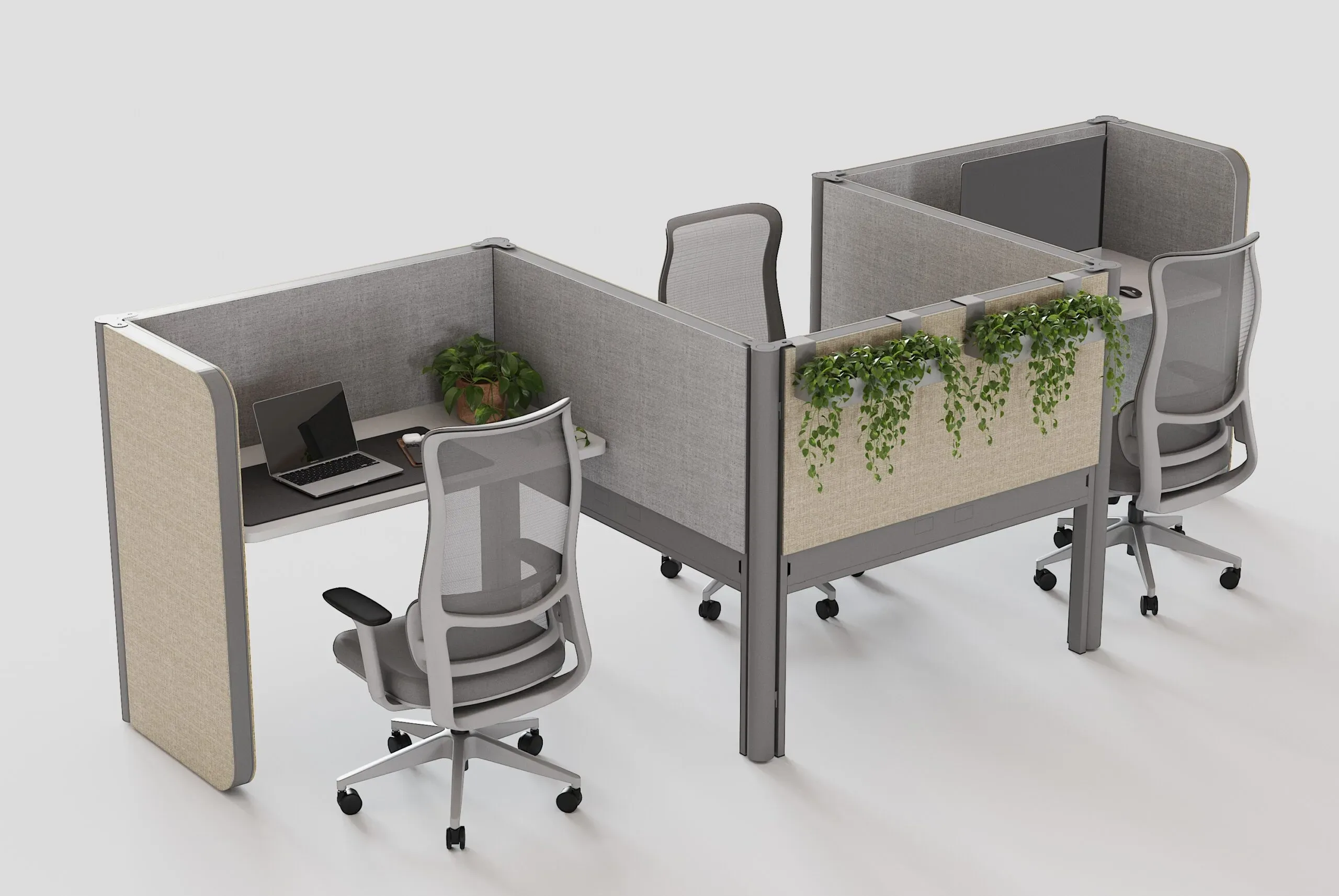
- Acoustic upholstery: the most versatile option; it offers a wide variety of colors and textures, plus sound absorption.
- Glass with color vinyls or finishes: adds brightness and allows play with transparency and privacy.
- Translucent colored acrylic: lightweight, luminous, and easy to clean; ideal for details and partial dividers.
- Colored laminates: durable and easy to maintain, with smooth or textured finishes.
- Mixed combinations: color panels with neutral metal frames, or combinations of upholstery and glass, to balance presence and lightness.
Explore the possibilities in our finishes section.
Color and Acoustics: A Strategic Combination
Creative offices tend to be dynamic, noisy spaces: conversations, calls, background music, and teamwork. Partitions upholstered in color serve a dual purpose: they decorate and absorb sound. Choosing them for real acoustic properties, not just looks, makes a difference in the team's focus. Learn about our acoustic solutions for offices.
Application Ideas by Zone
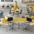
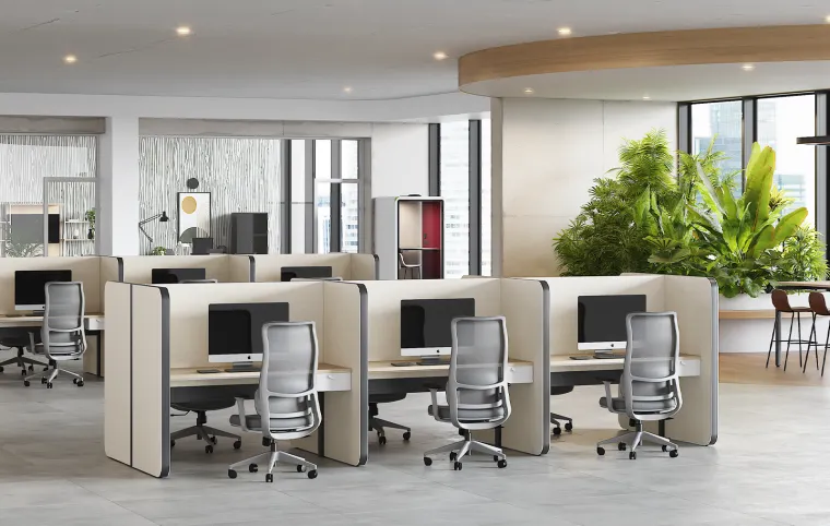
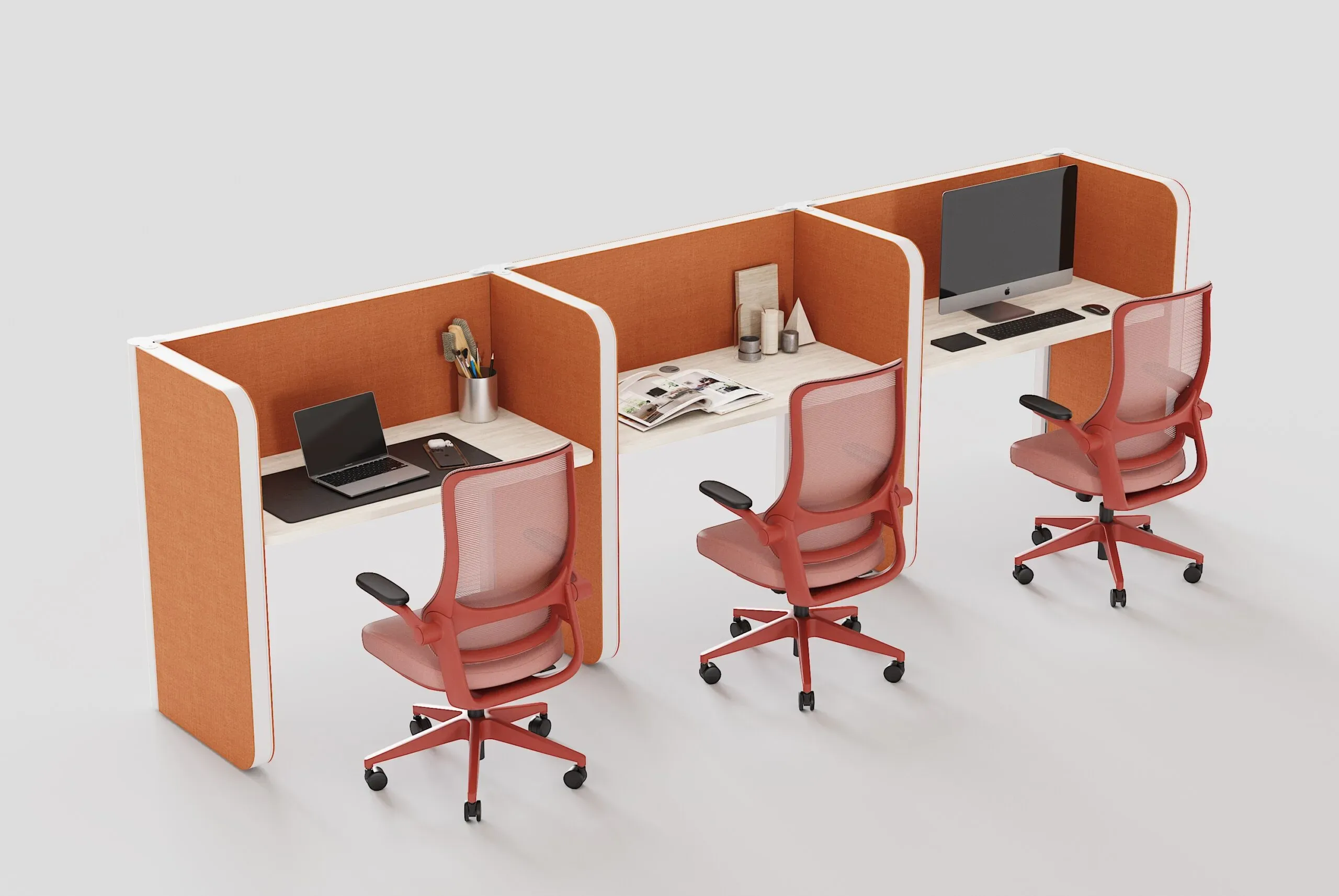
- Workstations: mid-height partitions in an accent color for each team or department. Check out our workstations.
- Focus areas: calm tones like blues, greens, or soft grays, with greater height and acoustic treatment.
- Collaborative zones: warm, energetic colors, with low or semi-open dividers.
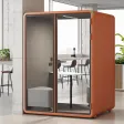
- Meeting rooms and phone booths: a mix of glass, upholstery, and color details for privacy with character.
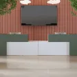
- Reception: a color element over a sober base for a memorable first impression. See our article on how to select furniture for a modern corporate reception.
- Break areas: warm tones and soft textures that invite a pause.
Flexibility: Colored Partitions That Move with the Team
Creative teams change projects and configurations often. Modular, mobile systems let you reorganize the space without construction, and color makes it easy to identify zones even when they move. If this option interests you, check out our article on mobile partitions and flexibility without fixed installation.
How to Integrate Colored Partitions with the Rest of the Furniture
Color works best when it plays well with the whole:
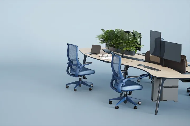
- Desks with clean lines and neutral tones let the partitions stand out without competing. Meet our desks and the guide to minimalist desks for clean-design offices.
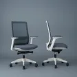
- Coordinated seating can repeat the accent color in small doses. Explore our office chairs.
- Storage in neutral tones keeps things visually tidy. Discover our storage solutions.
- Workstations for creative roles: for those who need more surface area, check out our article on large desks for creatives and designers.
Best Practices for Using Color Without Overdoing It
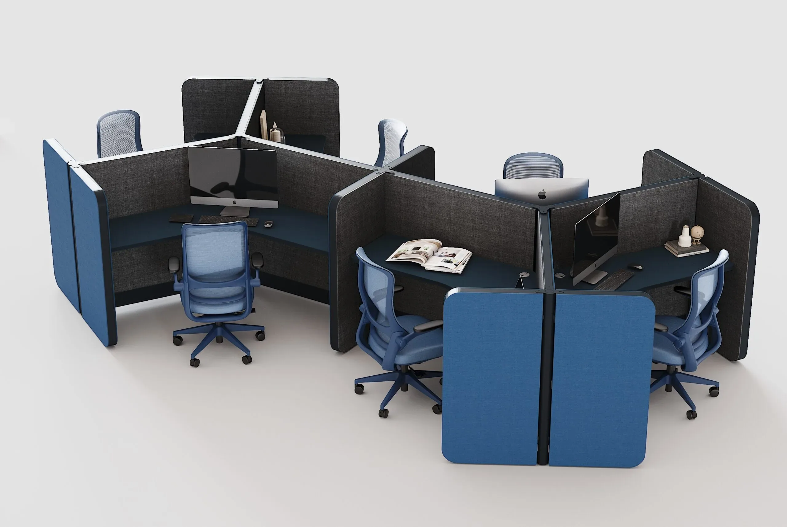
- Apply the proportion rule: about 60% neutrals, 30% secondary color, and 10% accent is a useful guide.
- Limit the palette: two or three main colors keep things cohesive.
- Repeat the color in different places to create visual rhythm across the floor.
- Mix textures: upholstery, glass, and laminates add richness without needing more colors.
- Avoid colors that clash with the brand or with existing finishes.
- Test real samples under the space's lighting before deciding.
- Plan for maintenance: very light tones show stains and very dark ones show dust; choose based on use.
- Respect safety: evacuation routes and civil protection codes must always be kept clear.
Which Companies Is It Ideal For?
- Advertising, marketing, and communications agencies.
- Design, architecture, and branding studios.
- Tech companies and startups.
- Audiovisual and content production companies.
- Coworking spaces with their own identity.
- Creative departments within corporations.
Common Mistakes When Choosing Colored Partitions
- Using too many colors at once. The result is visual noise, not creativity.
- Choosing on looks alone. A colorful partition without acoustic performance doesn't solve noise.
- Ignoring brand identity. Color should reinforce it, not contradict it.
- Overloading on intense tones. They can tire and distract people over long workdays.
- Not testing under the space's real light. Color changes with lighting.
- Forgetting maintenance. Some upholsteries and colors require more care.
- Neglecting modularity. A fixed solution limits future reorganization.
- Not coordinating with the rest of the furniture. Without cohesion, the space looks improvised.
- Following a passing trend. Trendy colors can age quickly; it's best to pair them with a timeless base.
How Línea Italia Can Help
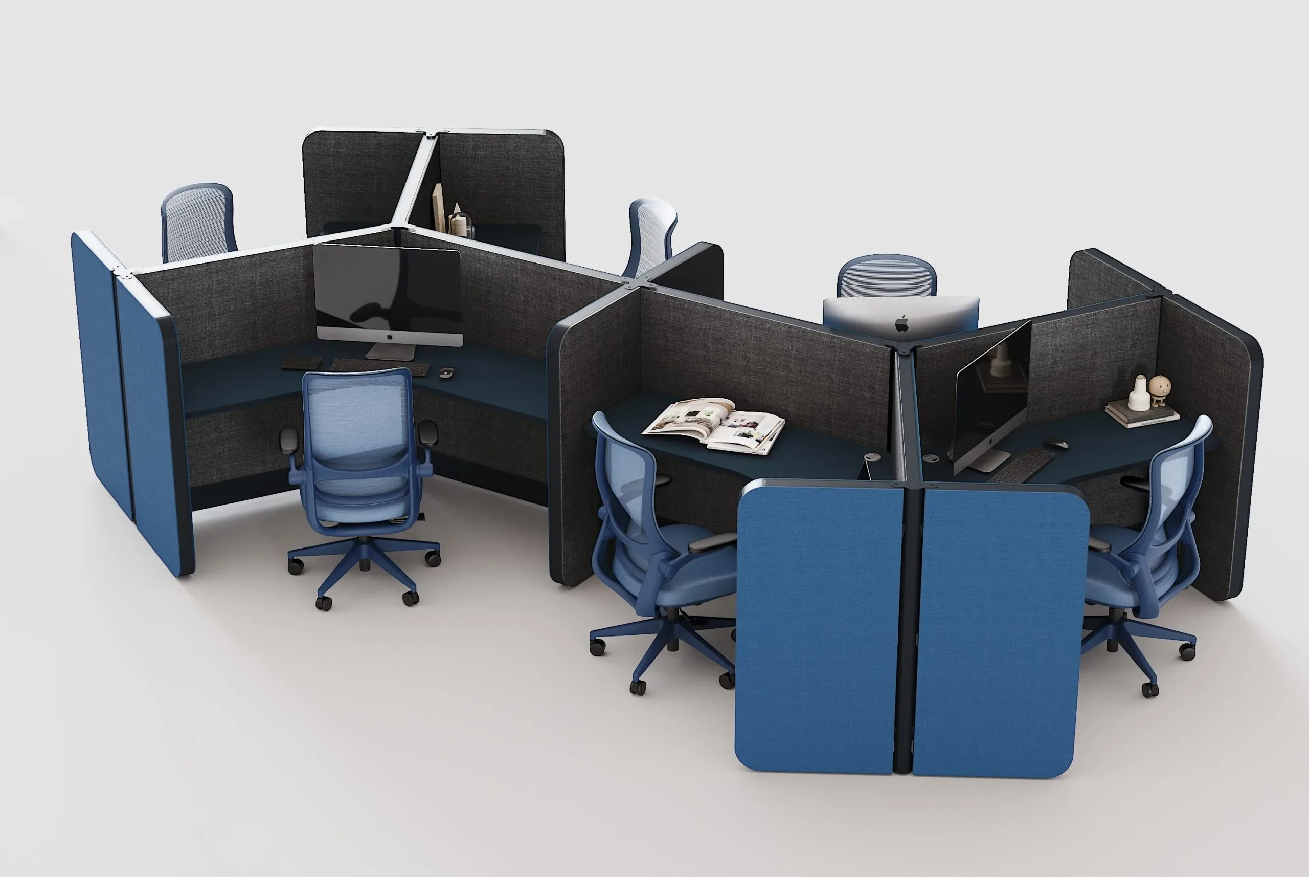
At Línea Italia, we design, manufacture, and install furniture and dividers for corporate and creative offices. We understand how your team works, analyze the space, propose palettes and layouts with 3D visualization, and coordinate partitions, workstations, storage, and finishes in one cohesive solution, through installation and delivery.
Learn about our process in space design, explore our corporate furniture collections, and see real examples in our projects section.
Conclusion
Colored partitions are one of the most effective ways to give a creative office its identity: they organize, separate, absorb noise, and communicate the brand's personality. The secret is in the balance: a neutral base, a limited palette, well-placed accents, and materials with real acoustic performance. Conceived as part of a comprehensive project, they turn color into a productivity tool and not just decoration.
Want a creative office with color, order, and character? Request a proposal from our team of specialists and let's design the space that inspires your team.